Clear cuffs: DIY
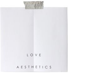
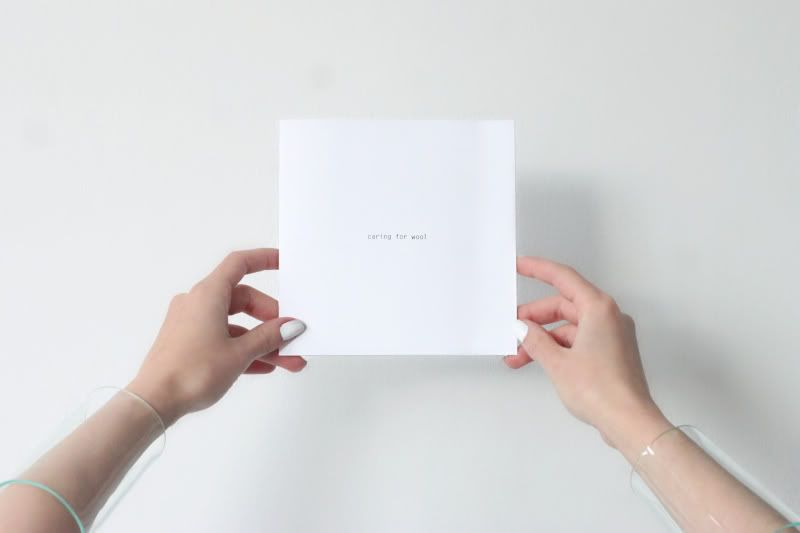
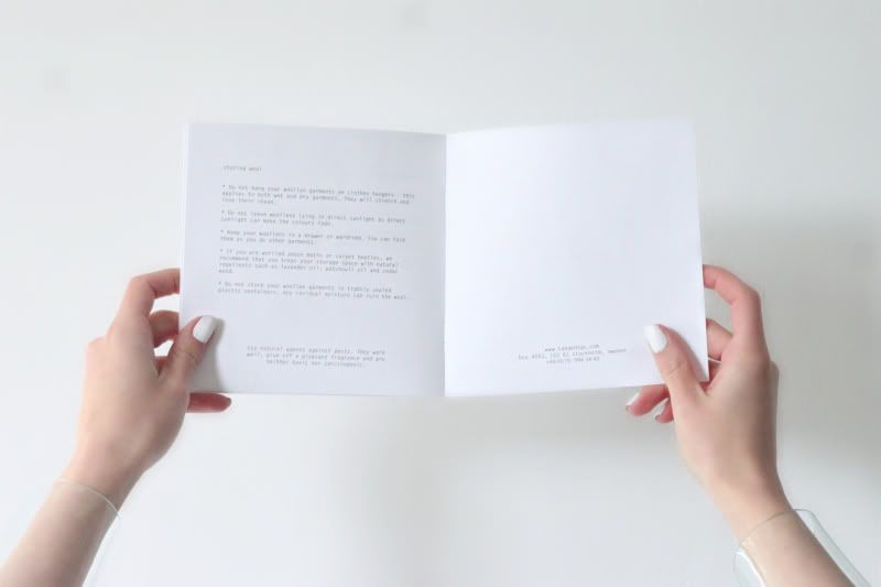
'As little design as possible' Dieter Rams would definitely approve of this little piece of printing. There, on a high table in a Stockholm boutique, in between colorful magazine covers and accessories was this high pile of white squared papers. It was not clear at all what these papers were for, no brand name in sight, no images, just the words 'caring for wool' in a tiny typewriter font. The papers looked like they just came out of your own household printer and were stapled together. It could not get any more modest and than this. The (lack of) graphic design, the ultimate simplicity, to the point of this leaflet consisting of nothing more than some dry information, made it stand out, it made it so incredibly interesting that it made you want to pick it up to explore its purpose and content. Though some might see this as boring, I think that minimizing the visuals and graphics so much, taking simplicity so far is a bold and radical decision. I like it and it worked!
In case you too are now wondering who made this; it is a guide for taking care of wool garments, made by Tangent Garment care. You can also read the full guide online here.
22 comments:
It's really simple. Love the cuffs
STYLEBYBRUNO.BLOGSPOT.COM
STYLEBYBRUNO.BLOGSPOT.COM
STYLEBYBRUNO.BLOGSPOT.COM
hell yeah.
amazing nails!
http://lavieenliz.com
In a world where everything is basically "screaming" for attention, it must be refreshing to find such a simple way of communicating...
perfect
SHEWOLF
http://stylelolajaro.blogspot.com/
Yes.
love the simplicity!
www.styleandshades.blogspot.com
In our time of colourfull advertisement this one IS actually unique..
www.designforaeon.blogspot.de
I love it, Its like everybody try to be the biggest and most colorful, and then a little pice like that just stand out from all the biggness and all the bright colours!
Dan ga jij de infobrochures van Antwerpen's modemuseum geweldig vinden! :)
Pretty cool:)
Super nice! En ik vind je arm cuffs nog steeds zooo tof X
Ha! Cool! I love it.
xo
Kara
www.thebostonista.com
There is no better way to catch the attention in my opinion. If somebody wants to lauch a new paper magazine they should think about it!!
Those cuffs are fantastic. I love how simple this is.
It's a LDN Thing
There is no better way to catch the attention in my opinion. If somebody wants to lauch a new paper magazine they should think about it!!
hello very good site thanks
best blog really thanks :=)
This post is invaluable. How can I find out more?
Also visit my homepage :: car locksmith san francisco
Great post, you have pointed out some fantastic details , I too conceive this s a very fantastic website. If you're looking for the best Things to do in the world, this list has something for everybody! From adventure to culture, food to history .
سداد القروض
إستخراج قرض جديد
Right now, I really want to talk to any Coventry students who need help achieving their academic objectives. I sincerely appreciate any student who wants to complete their work on their own. They can get in touch with them at assignment writers coventry if they want to get help.
Post a Comment